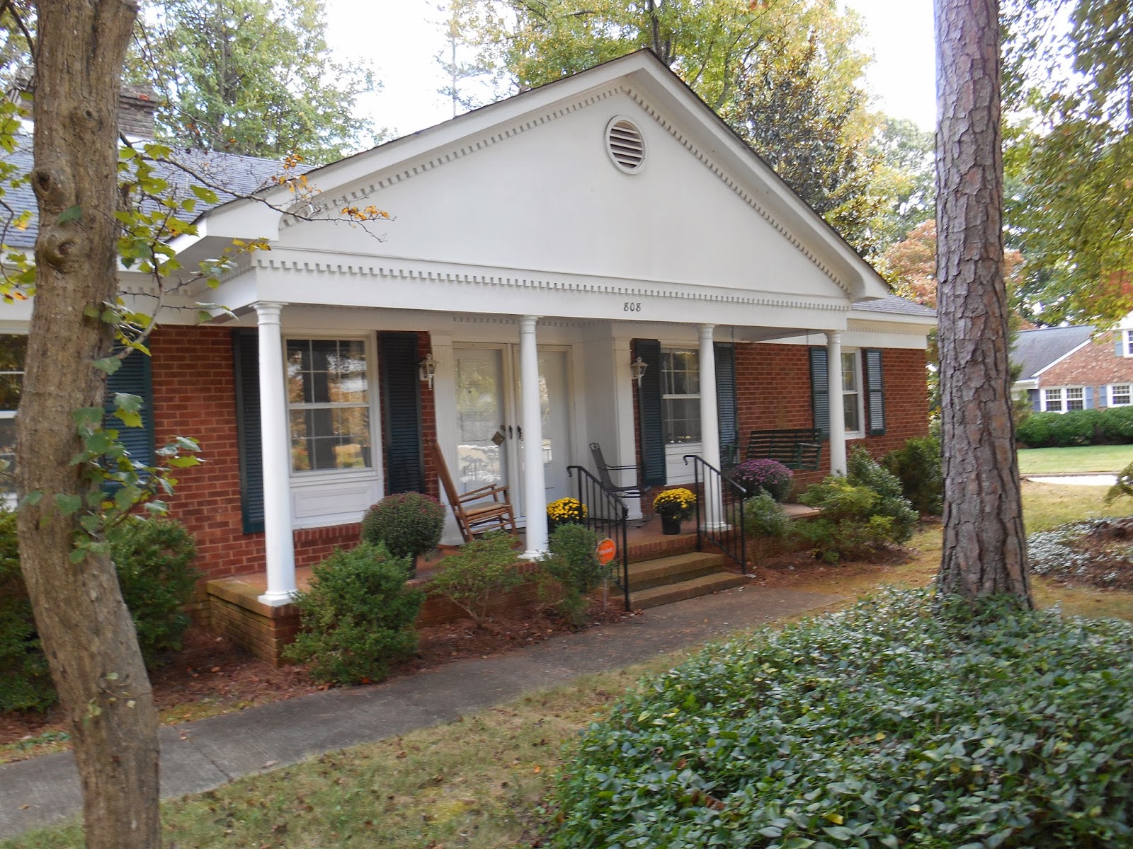
One of my FAVORITE things is the new front entry. Here is a photo of the original front door. This is what it looked like when I bought the house:
The door on the right is actually fake. It was odd to enter - once you were in the house it was okay, but it was just weird.
For a bit of perspective, here is what the whole entry looked like before the new went in.
Now -- voila! Here is the new front entry! A new door has been installed in the center of the space, and the formerly weird entry now looks a lot better, I think.
The paint around the new front door is sort of a light beige with some green in it -- it goes with the grout in the brick. I may repaint it later, but for now I think it looks nice with the wood grain (stained) front door. I like the beveled glass design, too.
-----------------------------------------------------
Back inside the house, as you enter the new back entry, I've established a nice little banquette breakfast area. Jeff the Carpenter made this lovely wooden piece that matches the lines of the kitchen cabinets. The seats are hinged and I can hide -- um...store -- yes, store, not hide -- stuff in those cubbyholes. There will be upholstered cushions on the seats and a tall upholstered back on the wall. There will be a pretty round table there, and a couple of chairs. I was lucky to capture Jeff's work on the banquette, in various stages of completion.
Jeff is hard at work!
A lot of progress now!
And, here it's almost finished!
And, voila! The completed and painted banquette! All I need now is the table, chairs, and cushions!
---------------------------
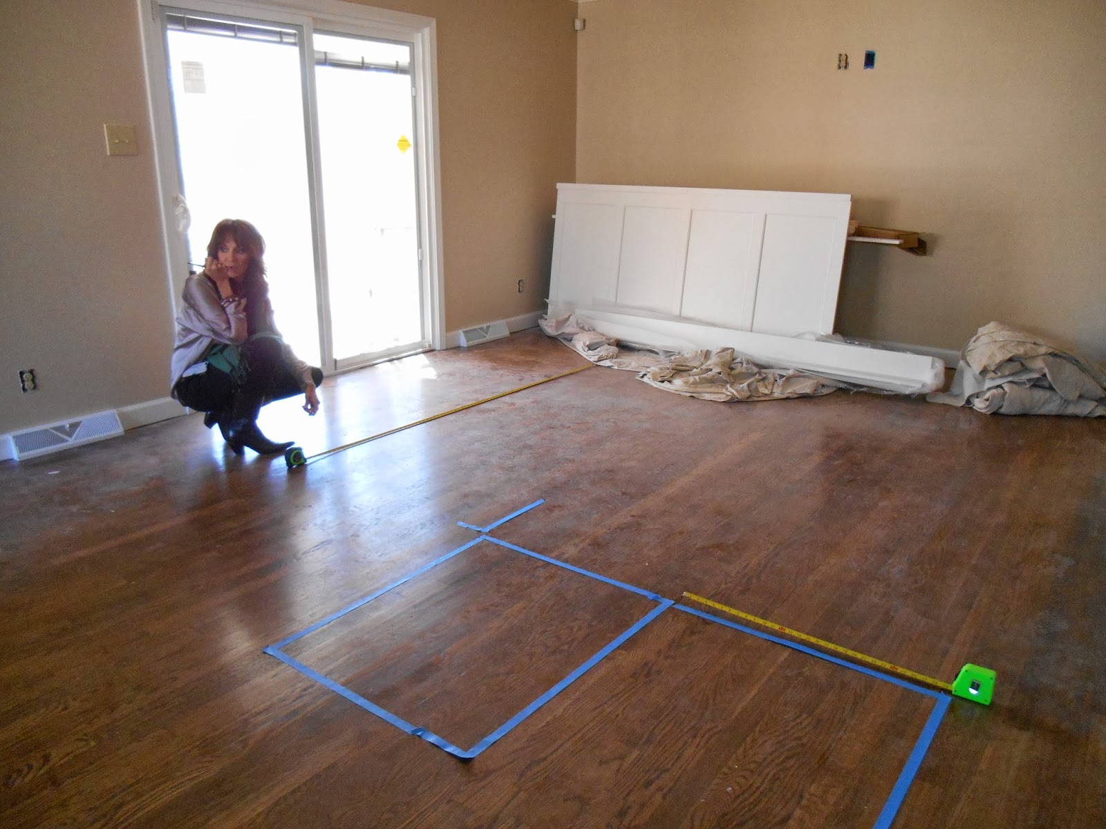
Here, Interior Designer Melinda ("Mel") Dickey is putting painter's tape on the floor so I can visualize the placement of the new chairs and sofa in the den. We discovered that even though the design is good we will need to do a bit of tweaking to maximize the traffic flow. Thank you, Mel!
That's all for now! Thanks again to everyone! Love, Carolyn


No comments:
Post a Comment